


Dyslexia South
Website
Brand Identity
Brand Implementation
Turned complexity into clarity, unlocking accessibility and driving impressive engagement.
About
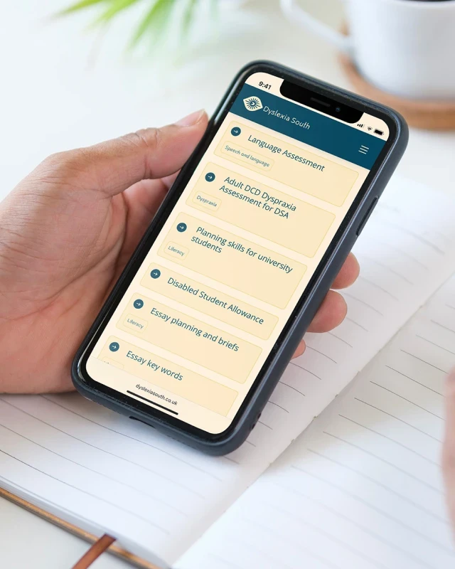
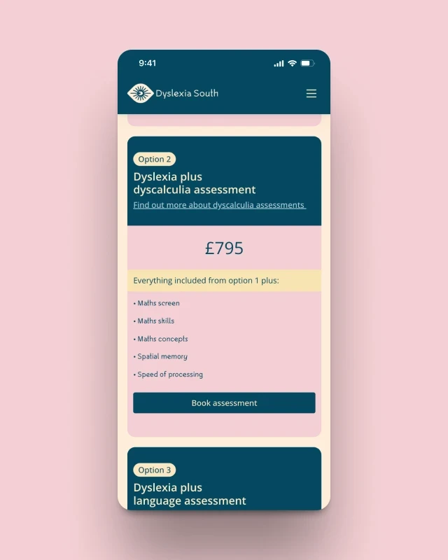
Dyslexia South is a trusted resource for individuals seeking assessments for dyslexia and other Specific Learning Difficulties (SpLDs). When the current owner took over the business, the website was rich in information but difficult to navigate and lacked a cohesive identity, which limited its ability to connect effectively with potential clients. Our focus was on accessibility and clarity. We began by developing a refreshed brand identity that reflected Dyslexia South’s values while addressing the needs of its audience. Dyslexia-friendly fonts and colour palettes were chosen to improve readability, and animations were kept to a minimum to reduce distractions. Every design choice was deliberate: plain backgrounds, intuitive navigation, and streamlined resource pages all contribute to a user-first experience. One key insight from the website’s analytics showed that free diagnostic tests were a major draw. We used this insight to inform our approach, fully redesigning the reading, spelling, and dyscalculia tests to enhance both usability and visual consistency. The new tests are now seamlessly integrated into the site and structured around a guided user journey, helping individuals take clear next steps after receiving their results. The results speak for themselves: improved engagement, stronger brand recognition, and a significantly more accessible online presence.
Year
2025
Industry
Education


Start your
project
Get in touch and let us work together to bring your project to life.


