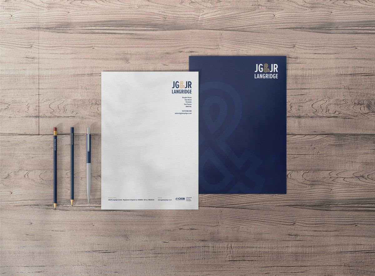
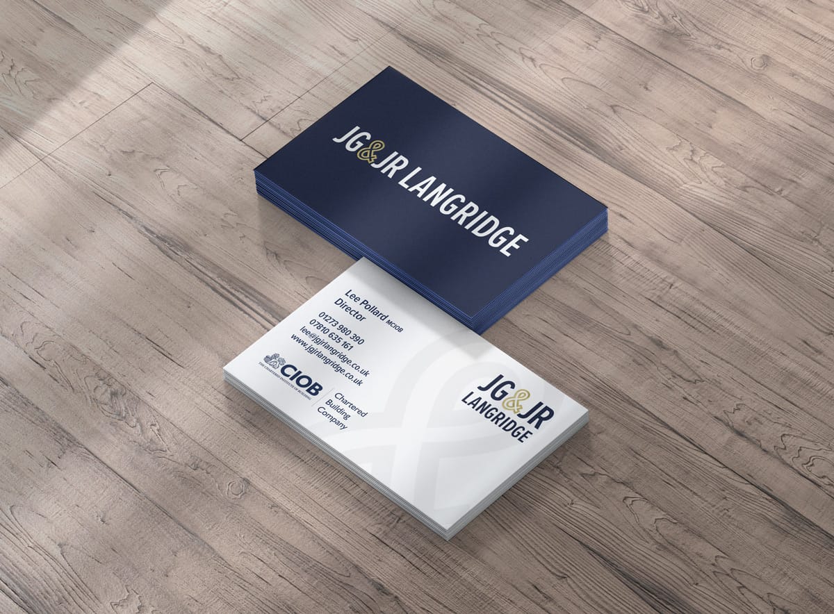
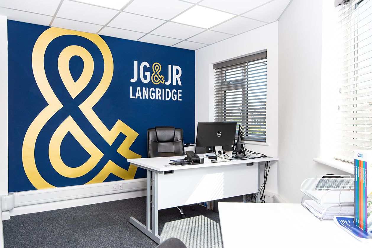
Using the ‘&’ as the key signifier of the brand I created a versatile logo which looks great in a single line or stacked form. From there, I developed a corporate brand design which still had a little playfulness.


Scroll Down
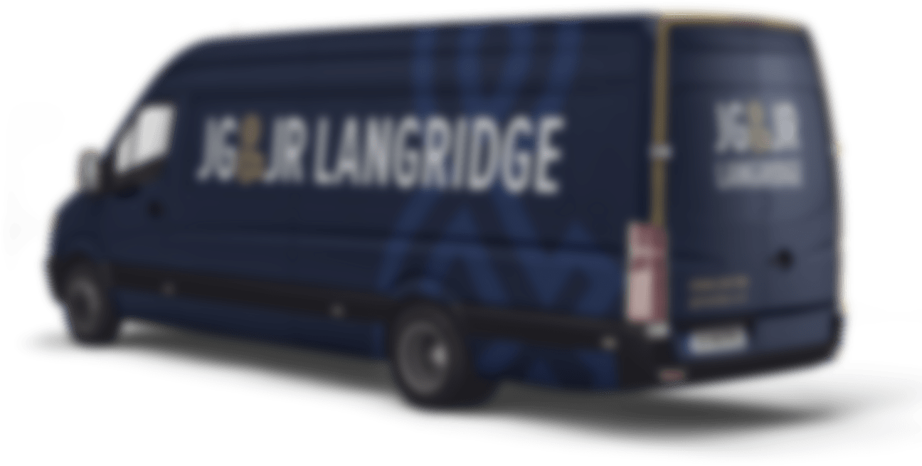
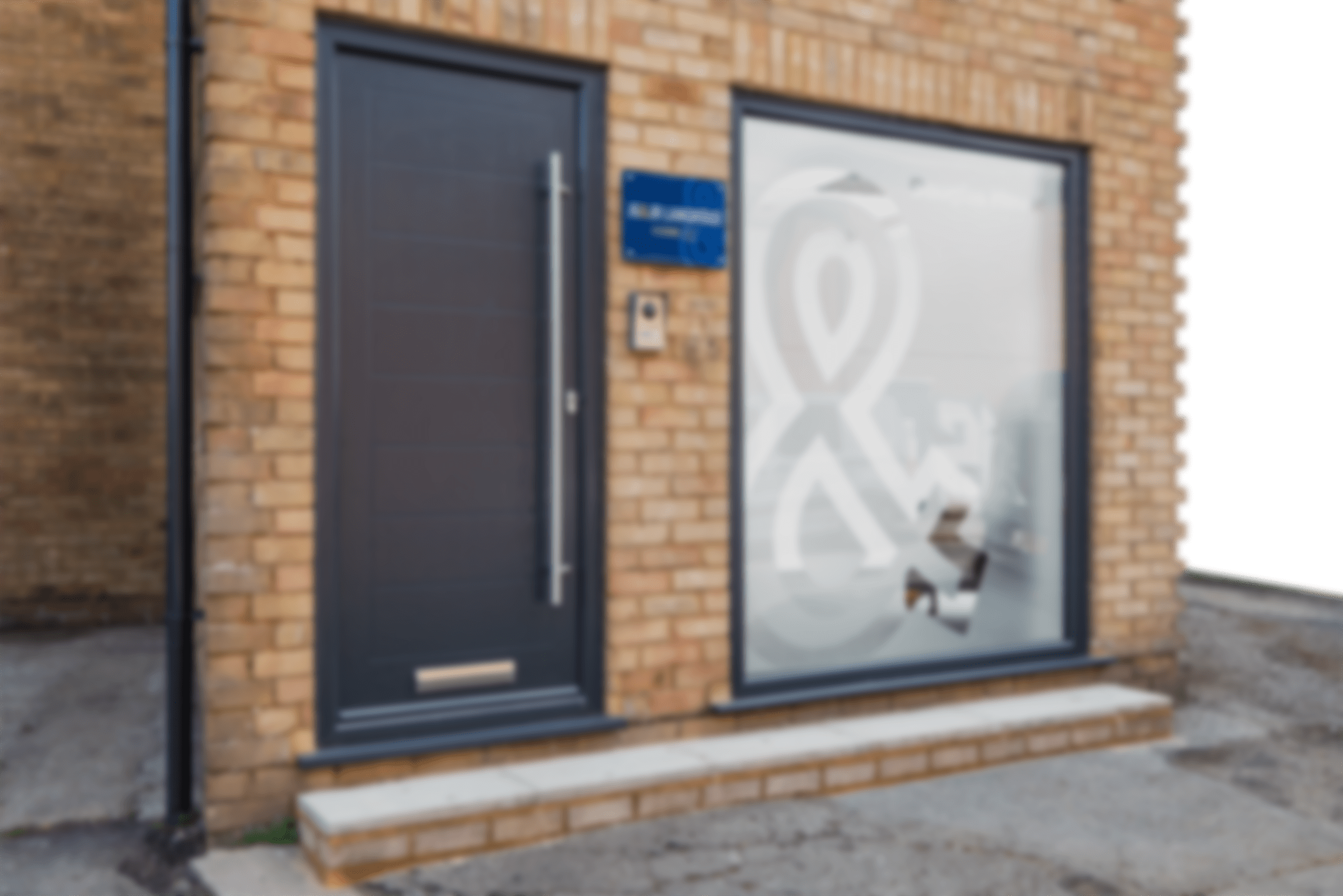
JG & JR Langridge
Chartered building company
JG & JR Langridge are a well established building firm in the South East of England with over 30 years of history. In that time however, the brand hadn’t really grown or evolved unlike the business. Together, we created a brand that was both impactful and professional.
Website
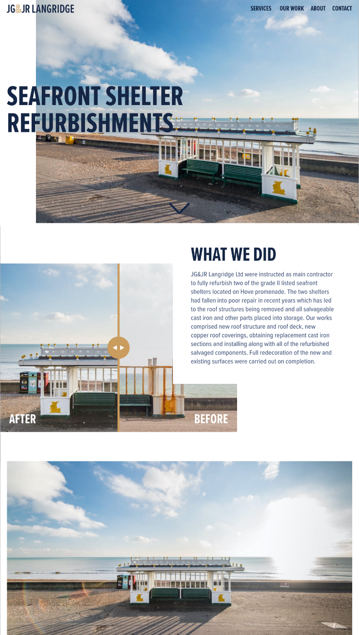
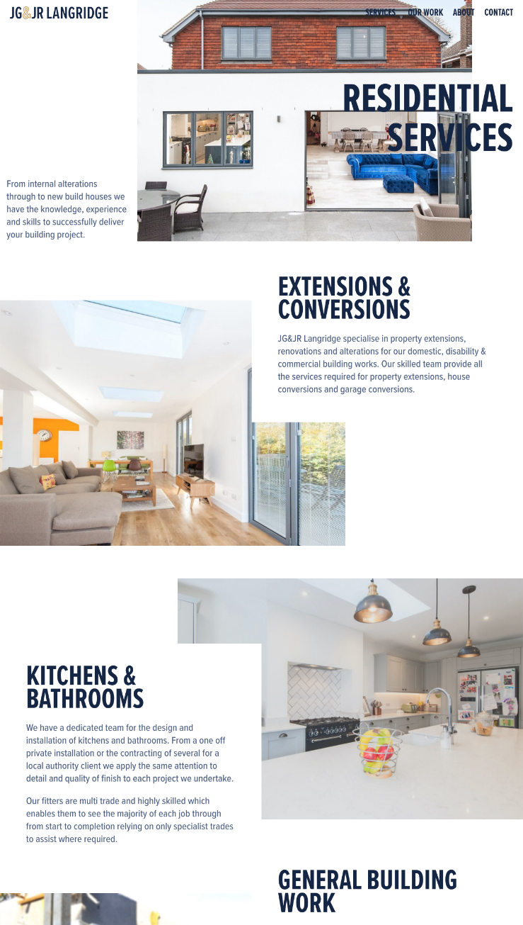
With a fantastic portfolio of projects, we created a website that let Langridges work speak for itself. Simple navigation, subtle animations and image detail popups, gives the user all they need to make sense of the quality services JG & JR Langridge have to offer.
Visit Website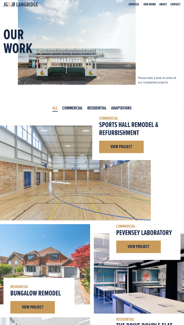
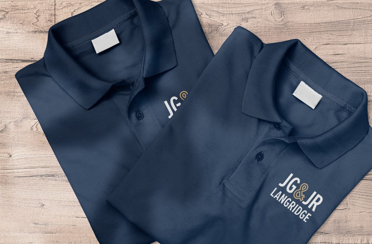
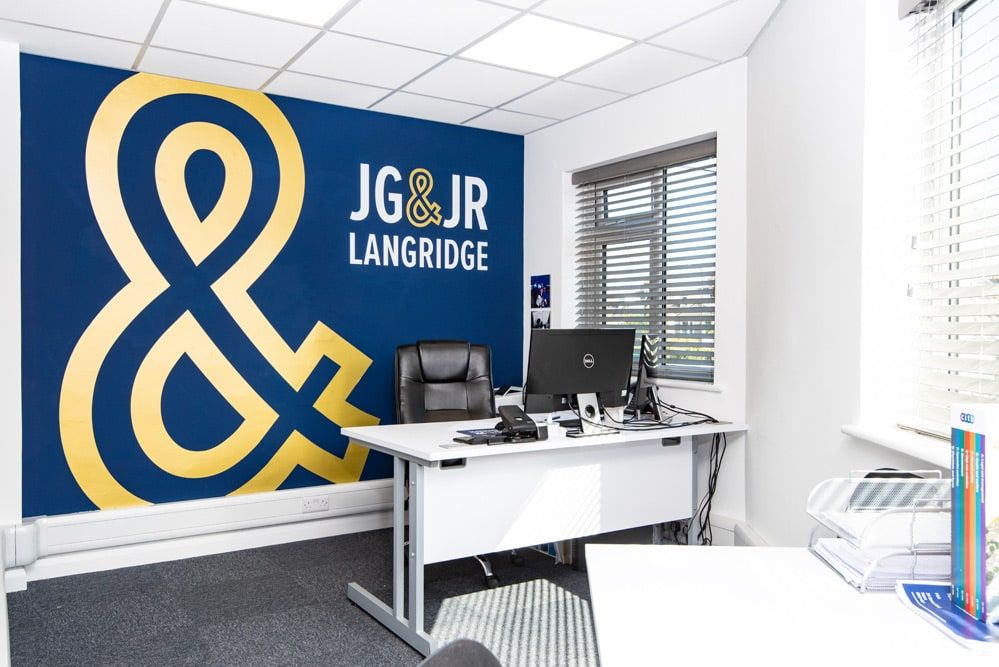
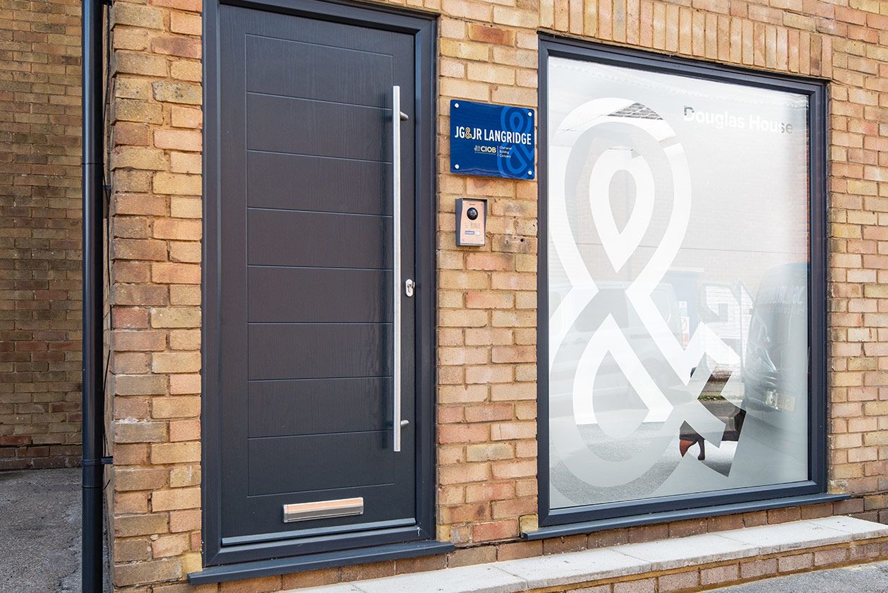
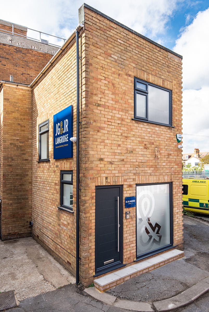
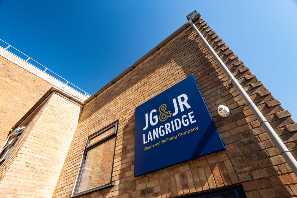
Signage
With new premises, Langridges thought it an ideal opportunity to introduce their improved identity into their workplace. Again the focus of the project was to get the right blend of professionalism and playfulness.
Lee Pollard DirectorGreg has recently helped us freshen up our logo, deliver a complete branding theme and has designed and built us a new website. Greg has been a pleasure to deal with throughout. Very approachable, great communication, very driven to get the best results and a fine attention to detail. We are very pleased with what he has produced for us. Many of our clients have also been really complimentary about his work. We wouldn’t hesitate to recommend Greg.