
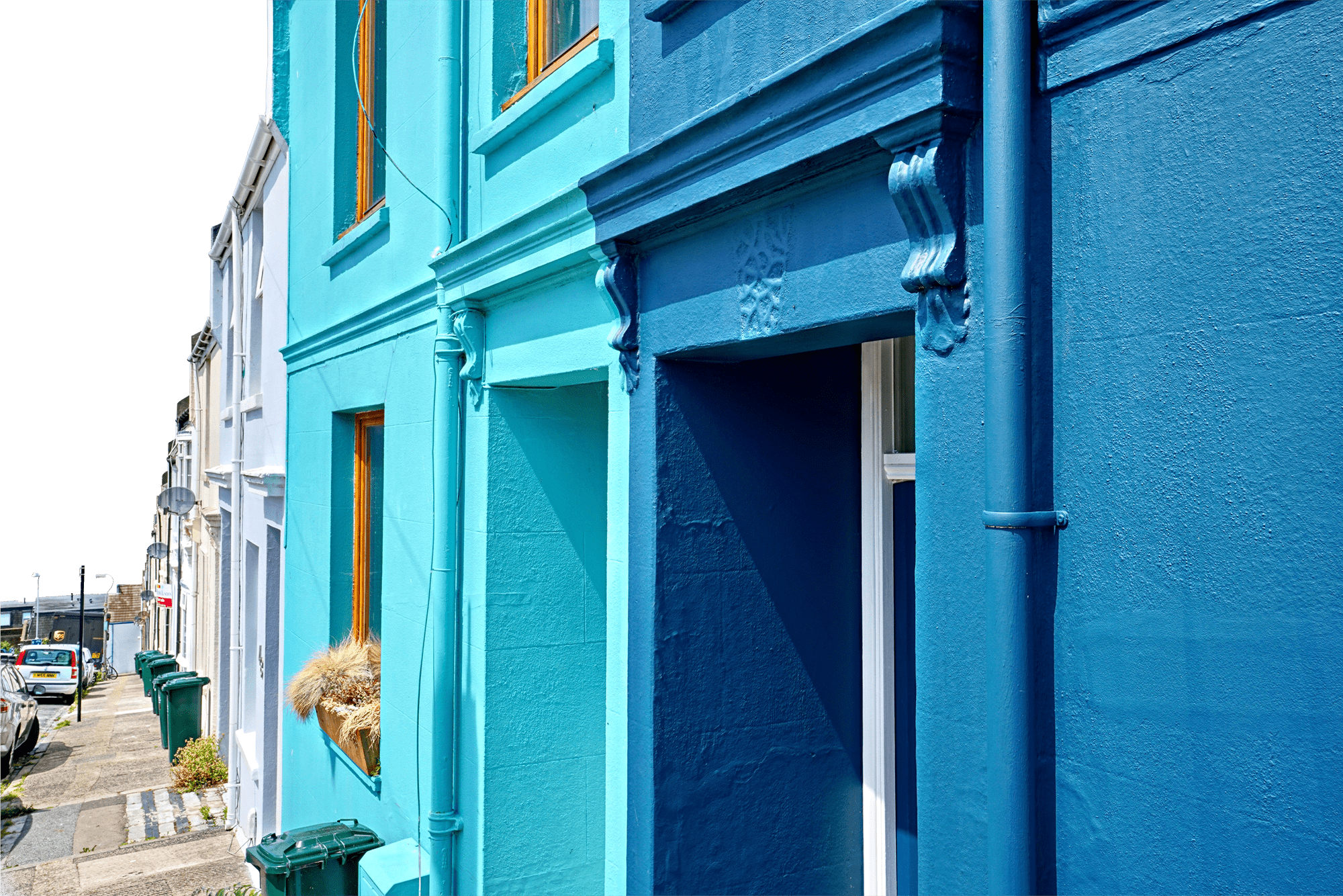
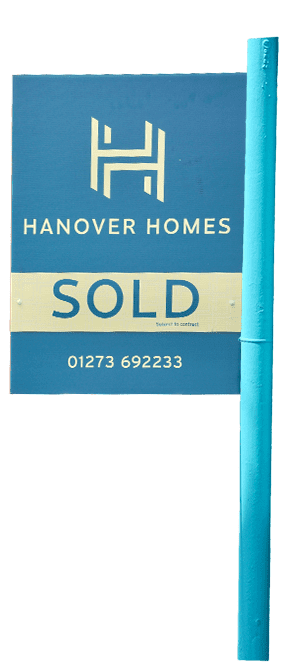
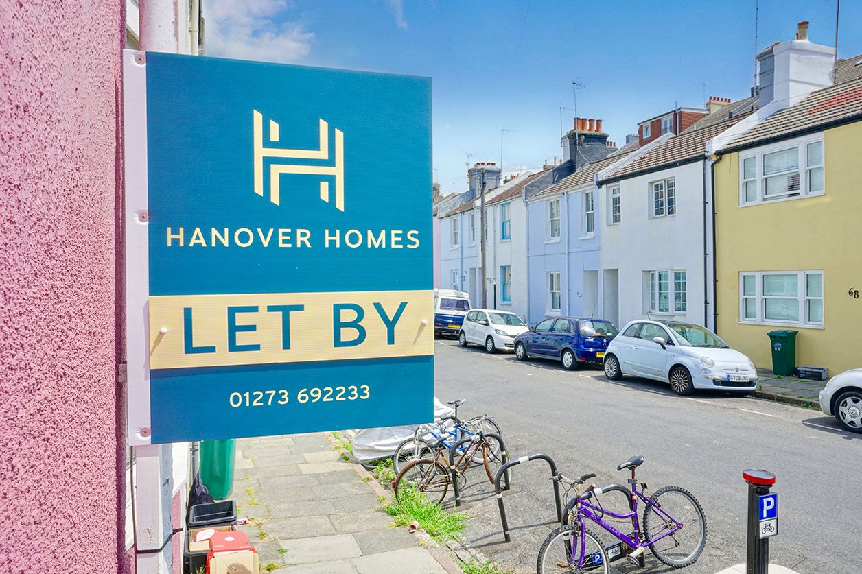
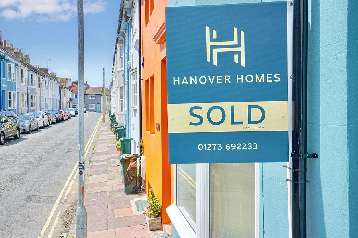
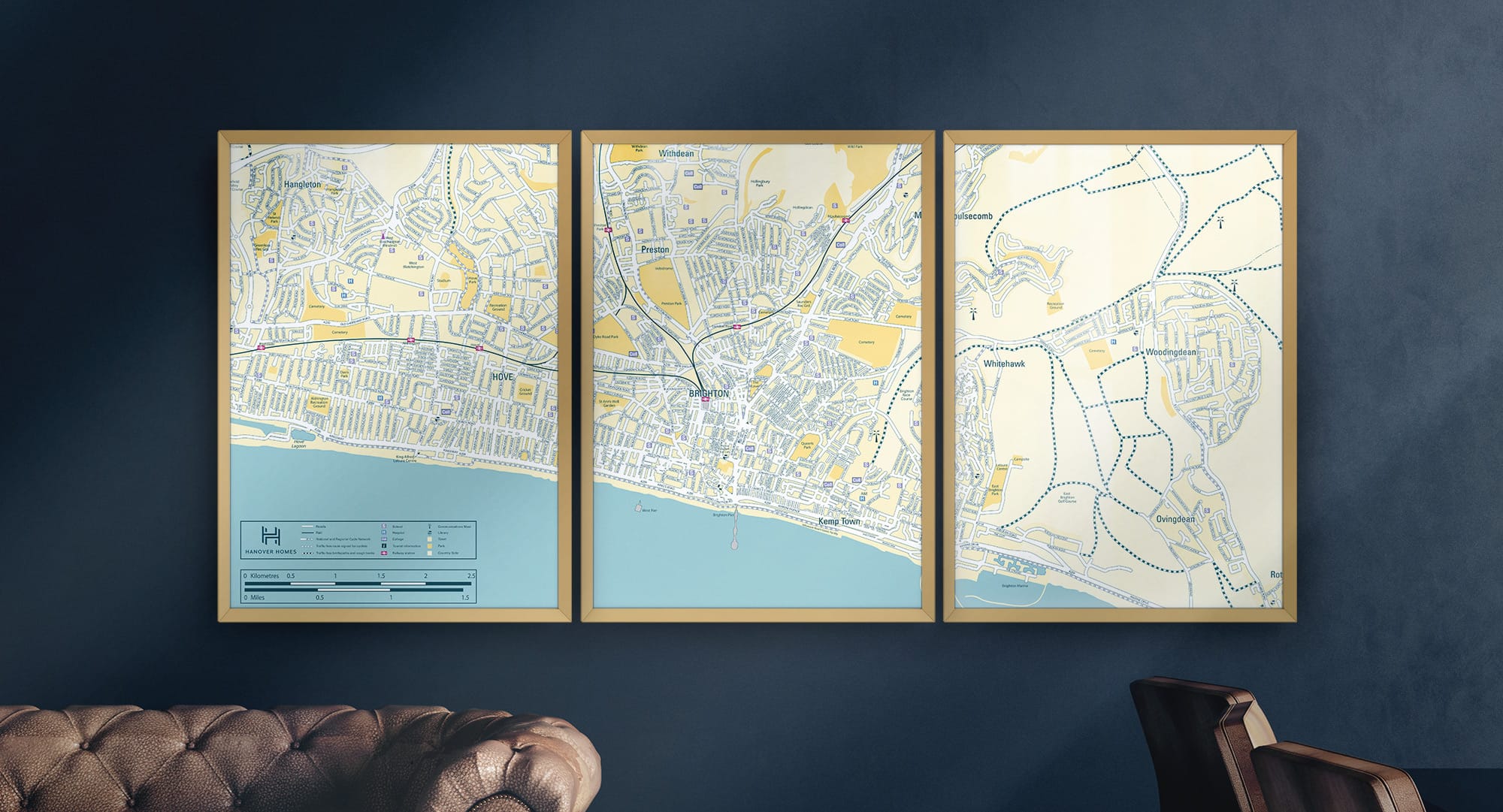
For the logo, I wanted to create something simple but versatile. Combining the two H’s of Hanover Homes created an abstract emblem. The slanted angles allowed for a great repeating pattern which could be applied across the brand. From stationery,facia designs to sales boards the focus was to be impactful to local surroundings.
Hanover Homes
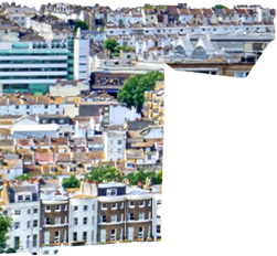
Brighton local estate agent
New estate agent Hanover Homes came to me looking for a brand that would stand out in the vibrant hills of Hanover in Brighton. Our focus was to create a brand that was striking but still sophisticated to attract a particular part of the local housing market.

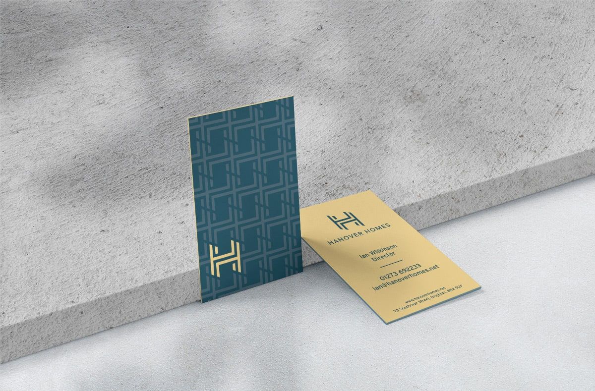
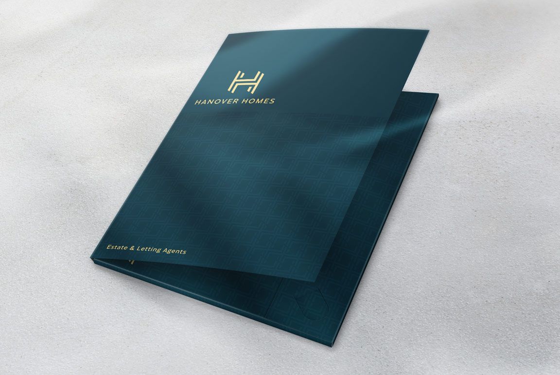
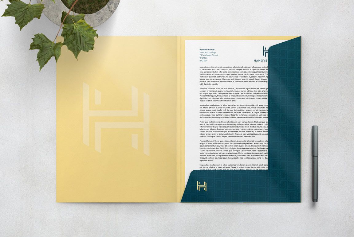
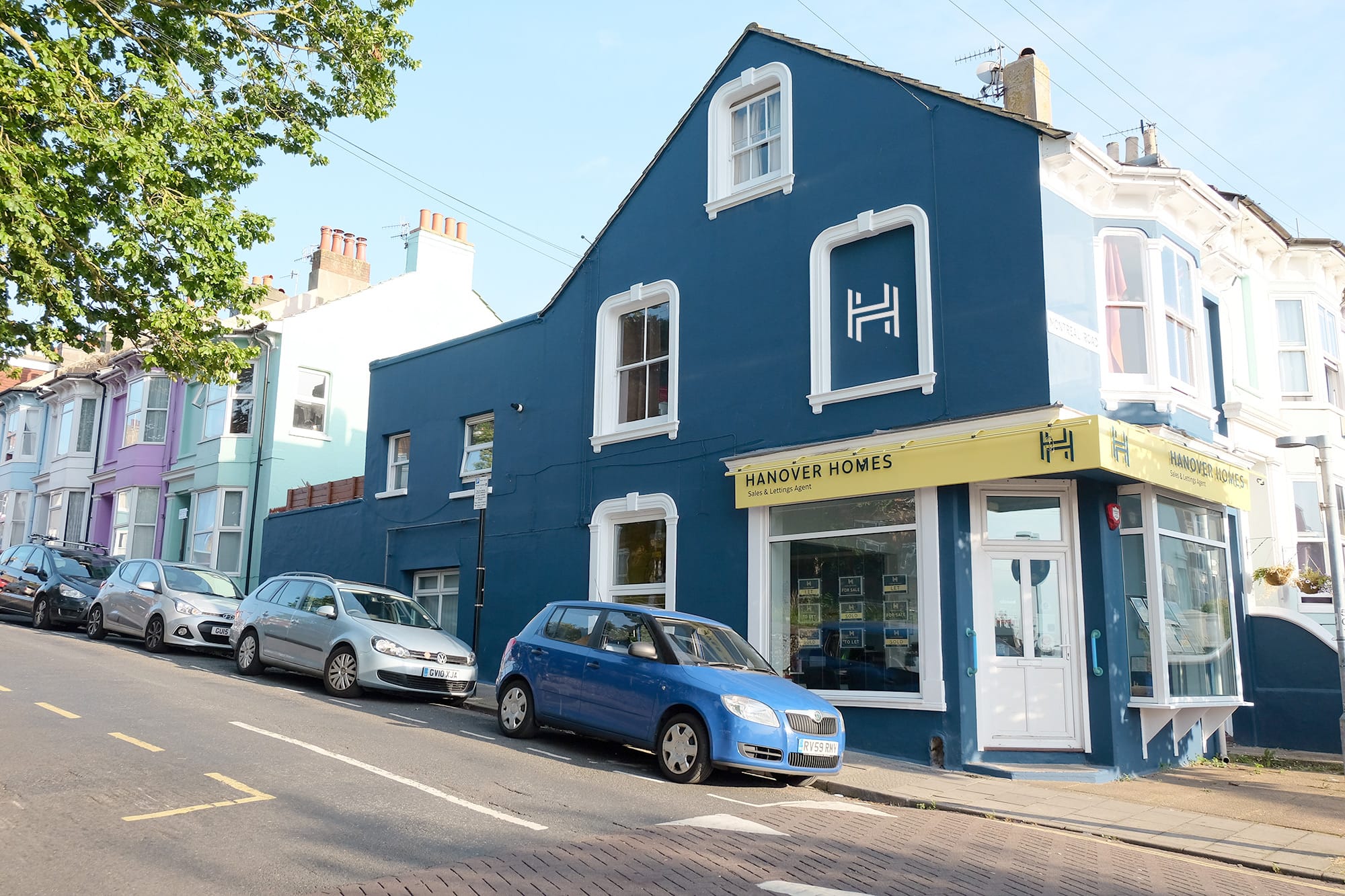
Ian Wilkinson DirectorGreg had previously carried out some design work for a previous employer so we had no hesitation in coming to him to assist us with a total branding of our new venture. He was tasked with designing a logo, for sale boards, business cards, folders, sign design and even interior and exterior colours for our office. We are again absolutely over the moon with the end result and frequently get told just how great our branding is. Greg is always polite, courteous and we wholeheartedly recommend him.